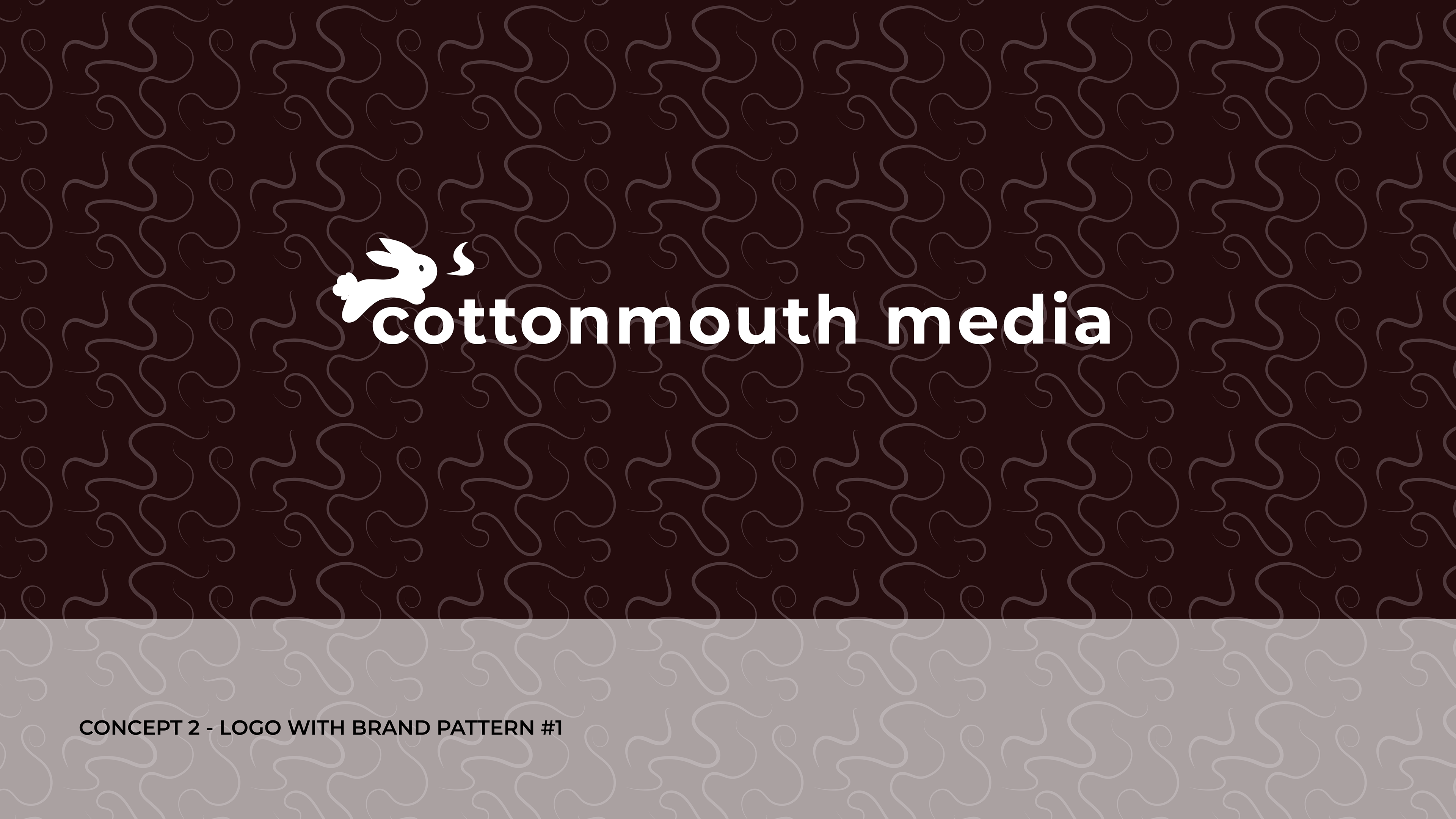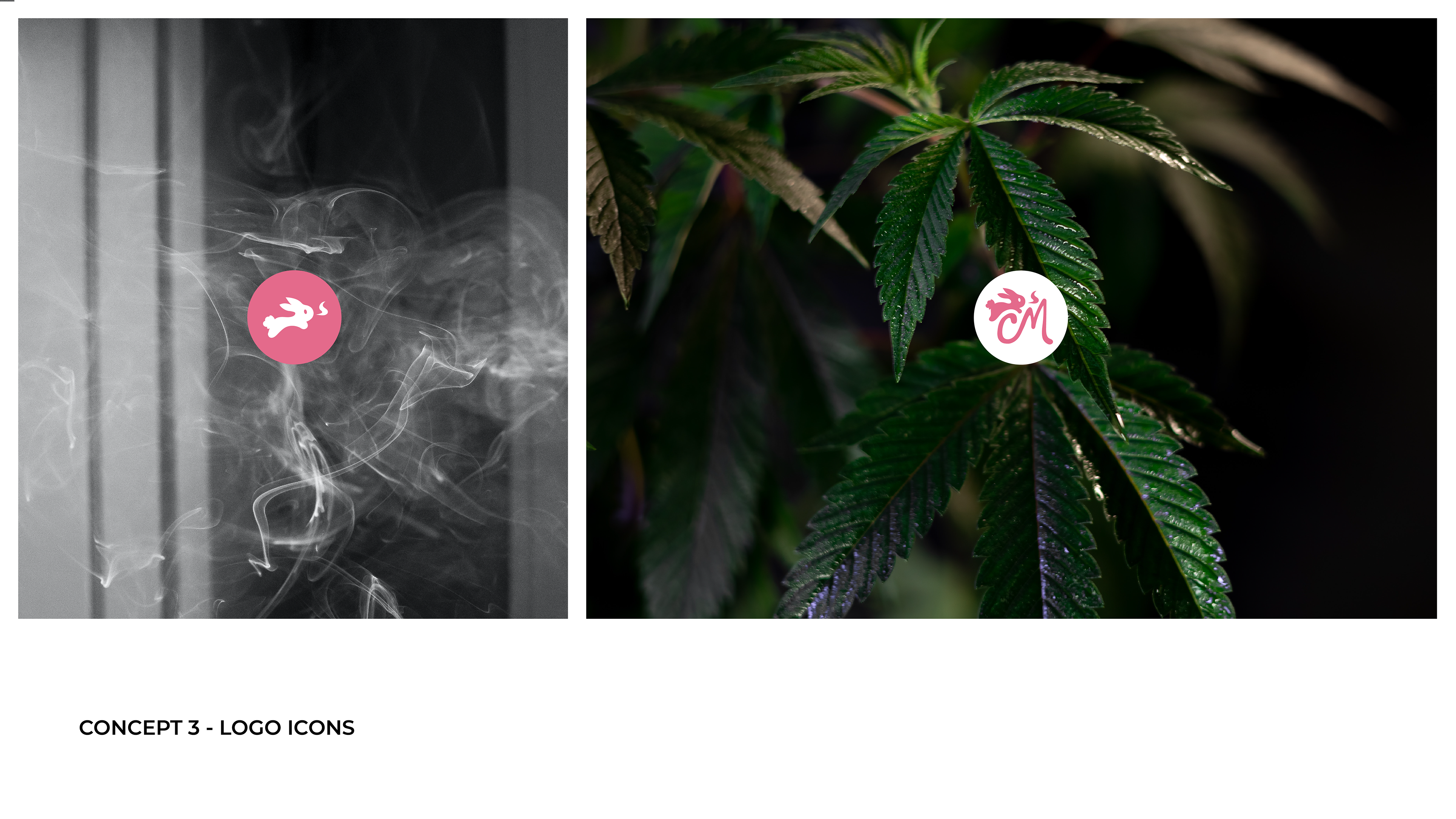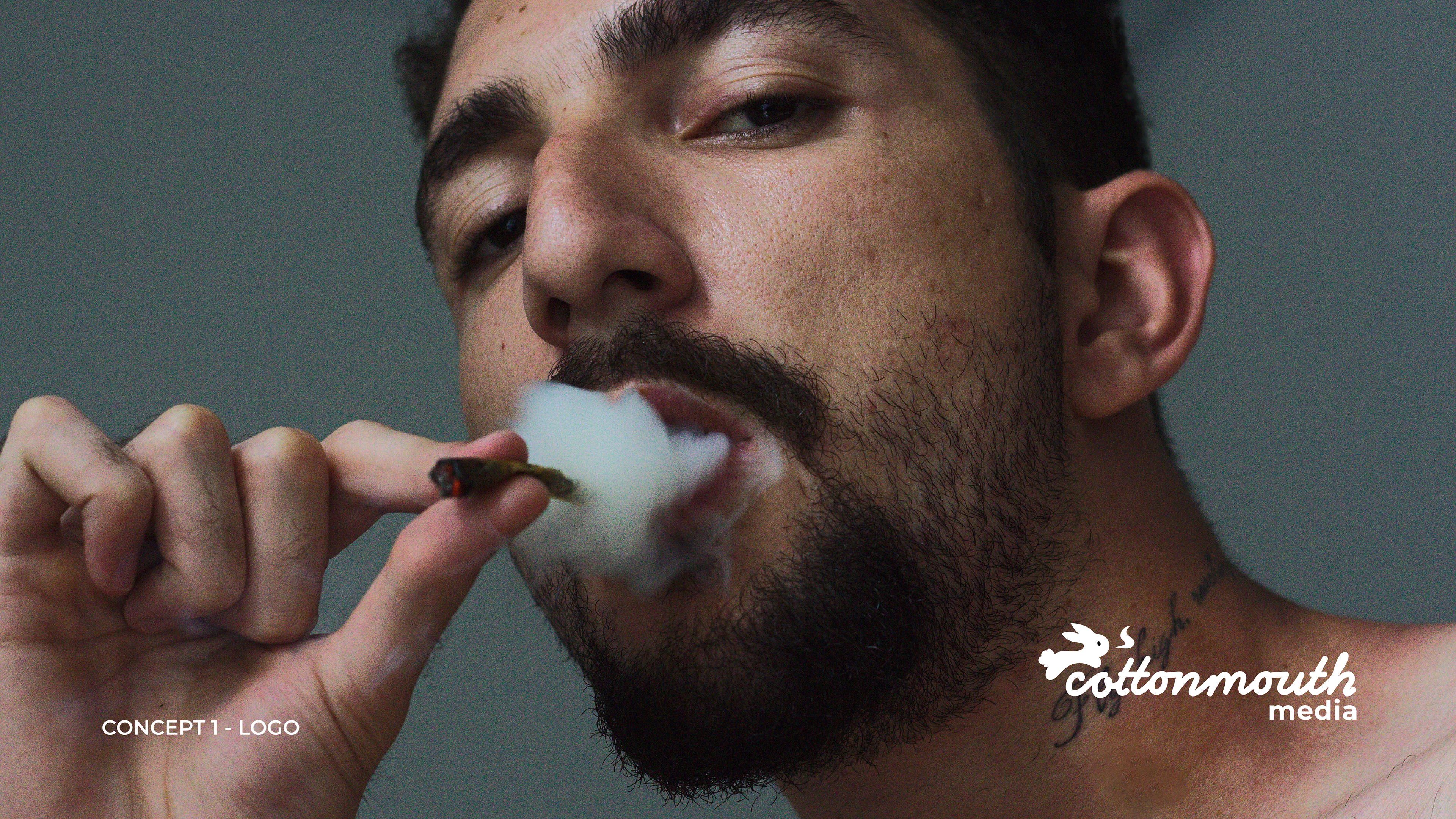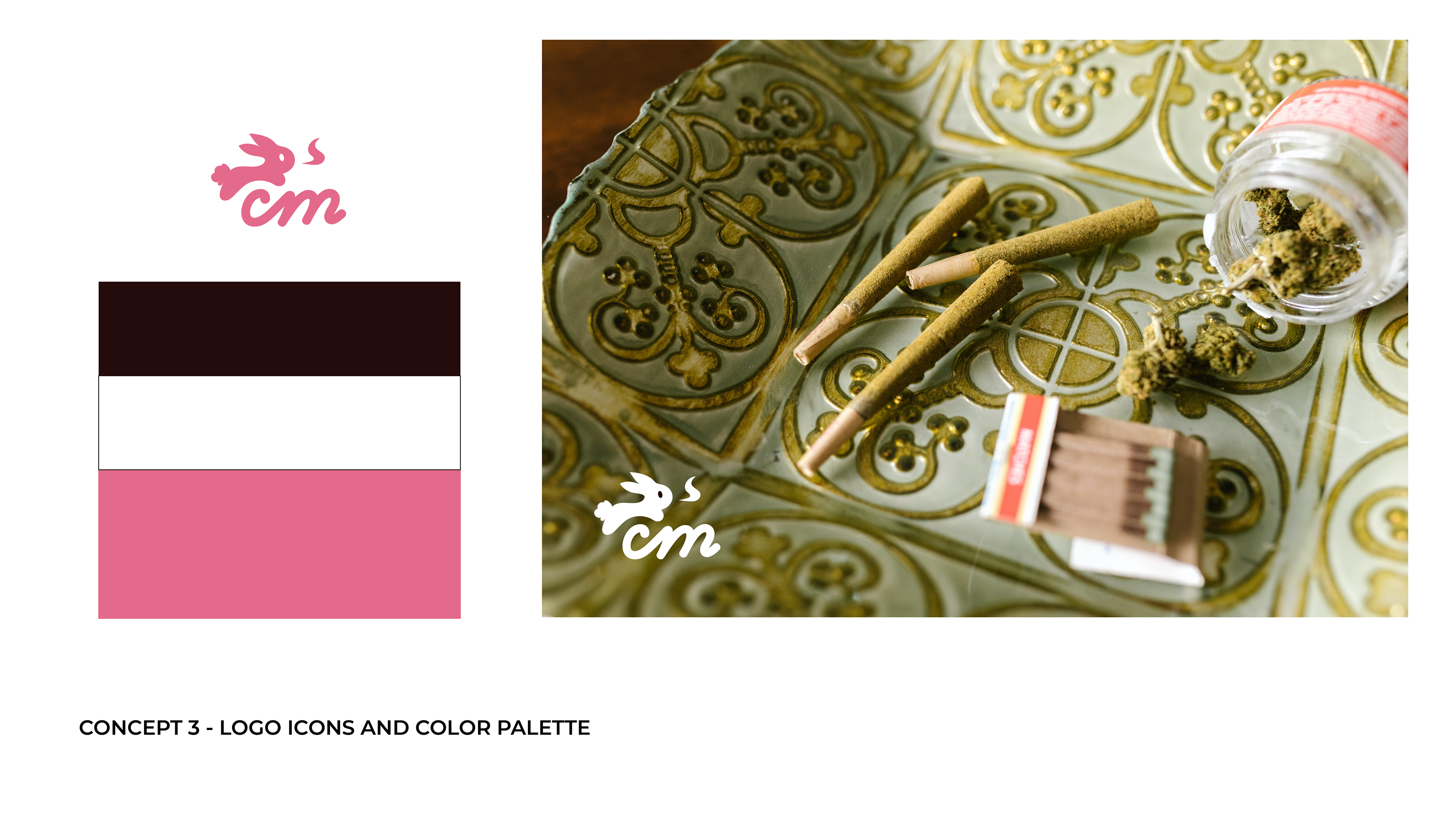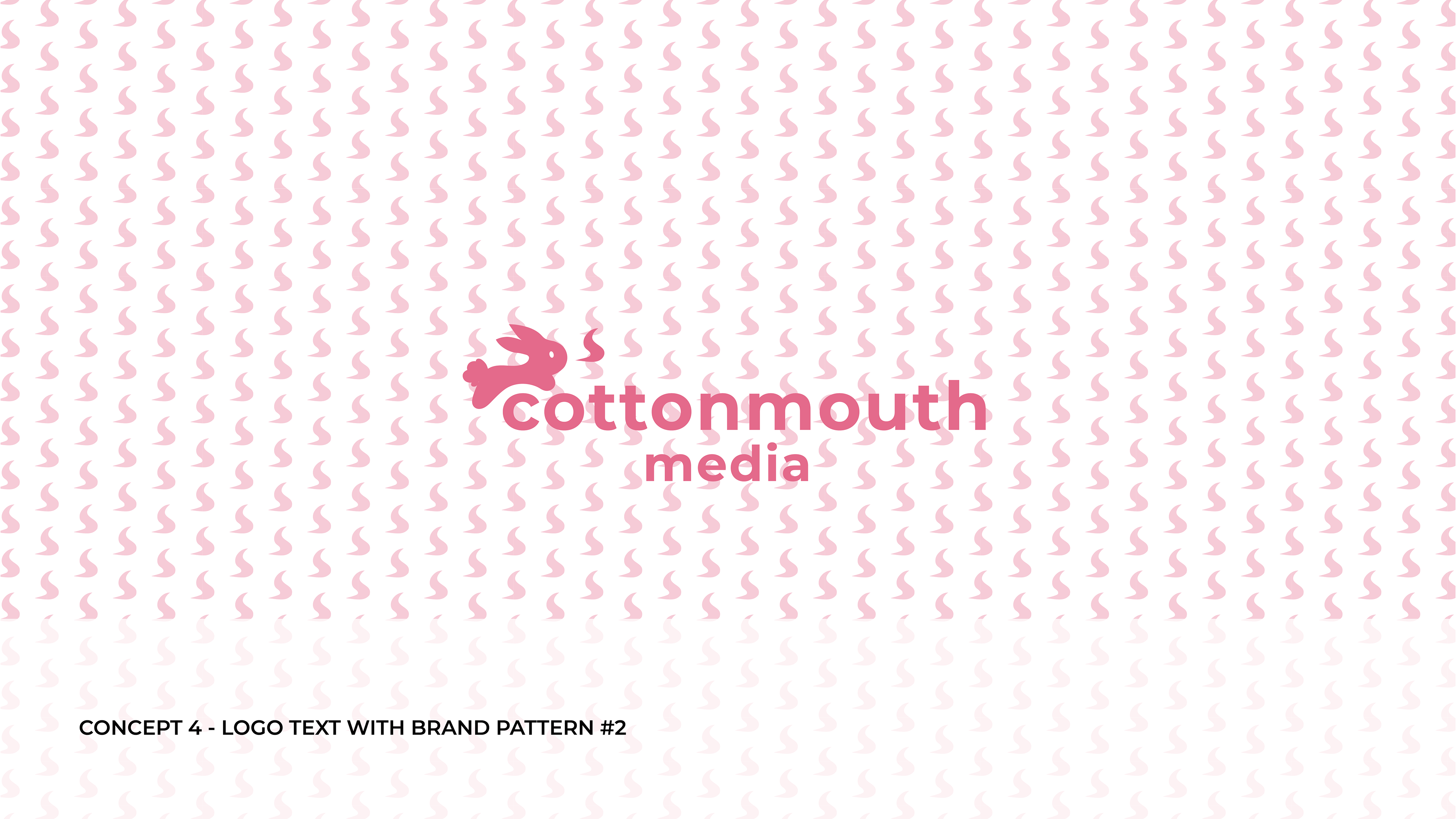
I redesigned the Cottonmouth Media logo to shift its traditionally male audience to attract a more feminine following. I utilized its pink branding and designed the bunny as its logo icon. The bunny graphic is a play on the word "cottontail" as it is similar to the company name "cottonmouth." I worked with the founders to create this logo redesign for their brand.
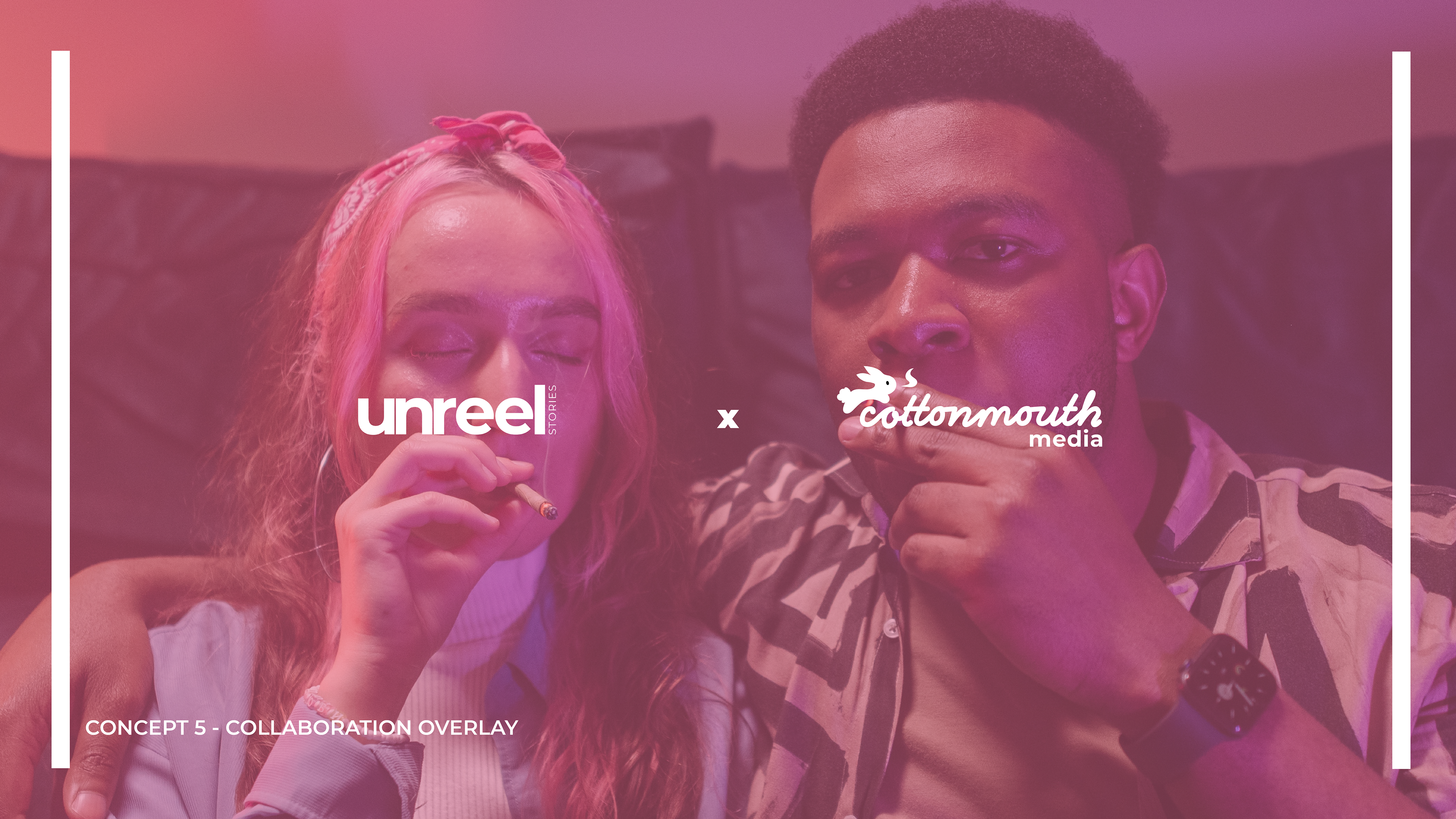
This media production company strives to break the stigma of marijuana through storytelling. The logo is creative and free, yet confident and unique. It can stand out among 20-30 year old consumers as approachable and friendly. The following slides are some of the logo identity presentations I created for the company. I made sure the branding was consistent with its sister company, Unreel Stories, as shown in the slides below.